ICMonstar
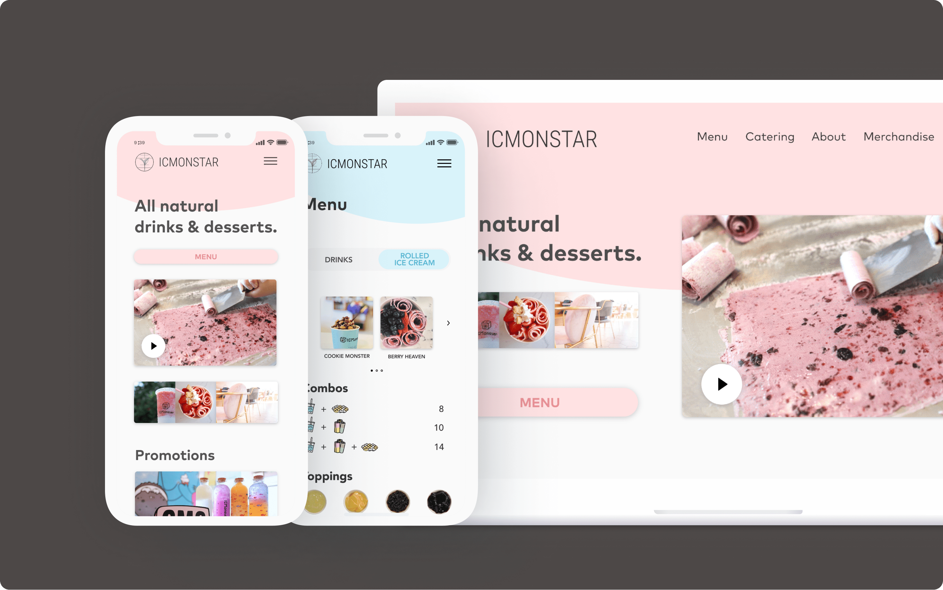
I redesigned a local tea shop’s online experience to attract a more diverse customer base and increase website engagement
//CASE STUDY
//WEBSITE REDESIGN
ROLE: UX/UI Designer, Researcher
TEAM: Gendarme Docena, Grace Chen, Nancy Zheng
TIMELINE: 3 months
Problem
ICMonstar is a local tea and dessert shop in San Diego that’s very popular amongst young families. However, despite the many unique offerings and cute characters ICMonstar provides, they struggle to attract the large college student population in the area.
RESEARCH
Meeting the Client
To gain a better understanding of ICMonstar, we spoke with the owner and CEO Jenna, who gave us insights as to the current state of her shop and what ambitions she has for its future. From the initial conversations, we learned that the shop is one of the only ones offering rolled ice cream in the San Diego area. However, ICMonstar’s constantly changing menu and aesthetic has dissuaded her from pursuing the daunting task of developing a website. Jenna is dedicated to building the best business she can and believes that a well designed website will be able to increase sales. Unfortunately she is limited on money and time, juggling two locations and another business at once.
KEY INSIGHTS
- ICMonstar separates itself from other cafes with their delightful cast of mascots
- There are many other tea and dessert shops in the area serving similar options
-
The shop realizes that their current branding may be polarizing for potential patrons
RESEARCH
User Interviews
We conducted user interviews with a mix of customers, potential customers, and employees to gain some insight on ICMonstar’s current reputation and their clientele. Below are some initial gatherings from this round of interviews:
- An extremely common first impression of the store was “cute”
- Different age demographics at each location (Millenials and Gen Z frequented the Convoy location)
- Typical customer behavior: Purchase rolled ice cream(most popular order), find seating, socialize
RESEARCH
Personas
To better target user needs in the redesign and increase empathy with our users, we then synthesized the interview results into the following personas.

Janet the Aesthetics Admirer
“This place is so pretty! I could take some cute IG photos here.”
“This place is so pretty! I could take some cute IG photos here.”
- Scours social media photos for attractive decor and drinks
- Values recomendations on what items to order
- Wants to take some nice photos to share on their story

Theodora the Deal Hunter
“I wonder if they have a points system I could join here.”
“I wonder if they have a points system I could join here.”
- Checks website and menu for prices and current deals
- Appreciates variety in options to order for their kids
- Looks for clean seating suitable for their whole family

Bob the Hospitality Hound
“I’m thirsty, which place can make drinks the fastest?”
“I’m thirsty, which place can make drinks the fastest?”
- Loves a quick ordering and pickup process
- Values positive interaction and service with workers
- Wants to easily figure out catering options for office orders
RESEARCH
Current Site Analysis
In order to gain a different perspective into which aspects of their business ICMonstar presents to their customers, we analyzed their current website.
- ICMonstar’s existing website places a large emphasis on their mascots, making it very family-friendly. Because of this emphasis on mascots, there is a lack of focus on the actual desserts and drinks offered.
- There are also no pictures of the cafe itself, therefore potential customers are unable to gauge the aesthetics of the cafe before visiting.
- Many menu items were redundant and the menu itself involved a lot of scrolling while neglecting pricing information, an important factor for many potential ICMonstar customers.
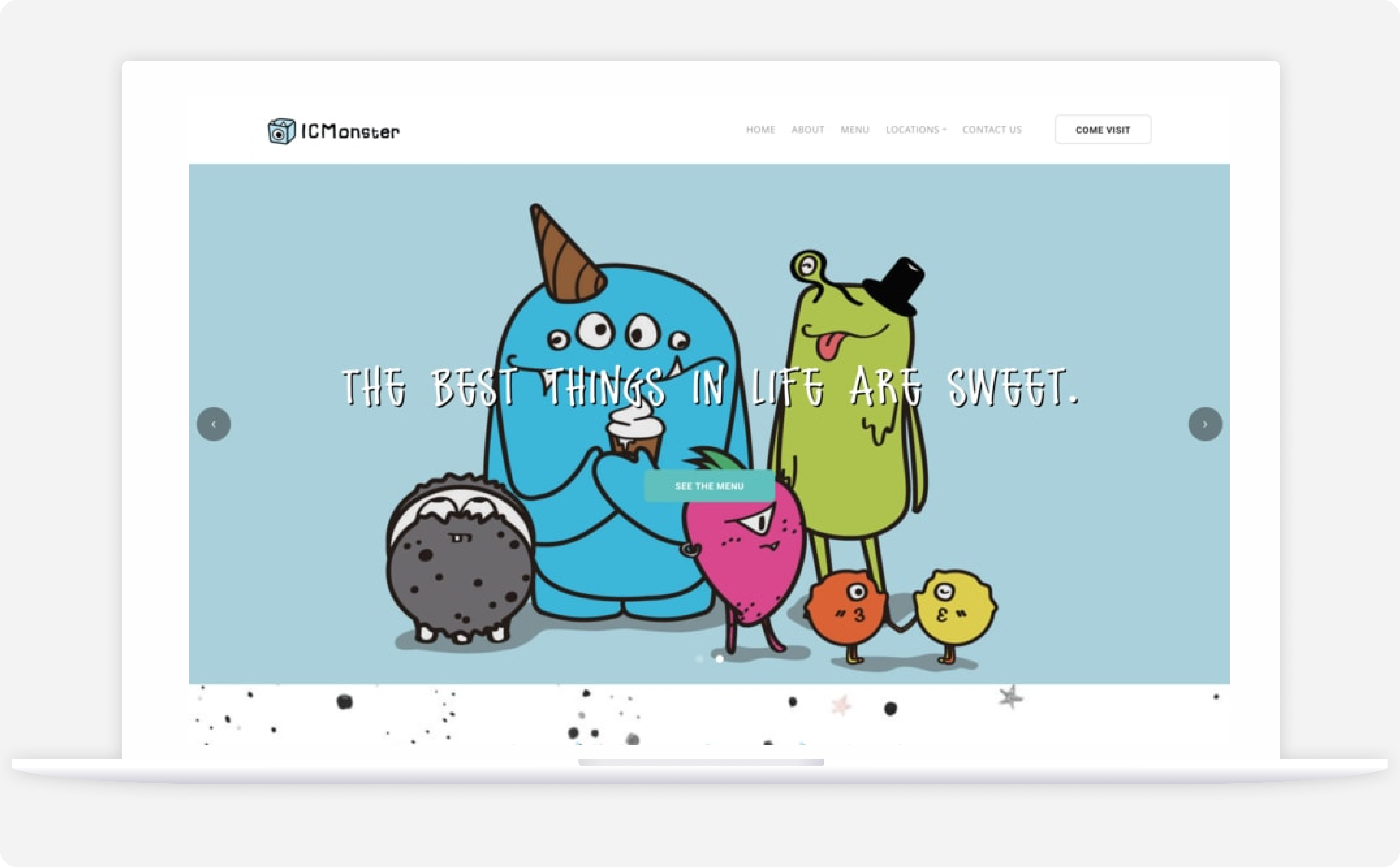 The original ICMonstar website
RESEARCH
Competitive Analysis
To gain some insight on what works and doesn’t work for branding, content, and site architecture, we conducted a competitive analysis on websites with a similar menu and market: 7Leaves, Bing Haus, Guiltea Cravings, Kung Fu Tea, and The Alley. These competitors were chosen as a mix of renowned local and international shops that we felt could give us some valuable insights into their design thinking. After some analysis, we noticed that the different competitors all shared several similarities regarding navigation labels and menu categorization:
- The majority of the cafes had a Menu, Locations, Hours, Social Media, and About page on their websites.
- Niche features such as merchandise from Kung Fu Tea and catering / fundraising from 7Leaves were noted for future use on the ICMonstar webpage.
- Most shops used black and white as their primary colors and reflect their aesthetic through their logo, fonts, and let their photographs take center stage.
DESIGN
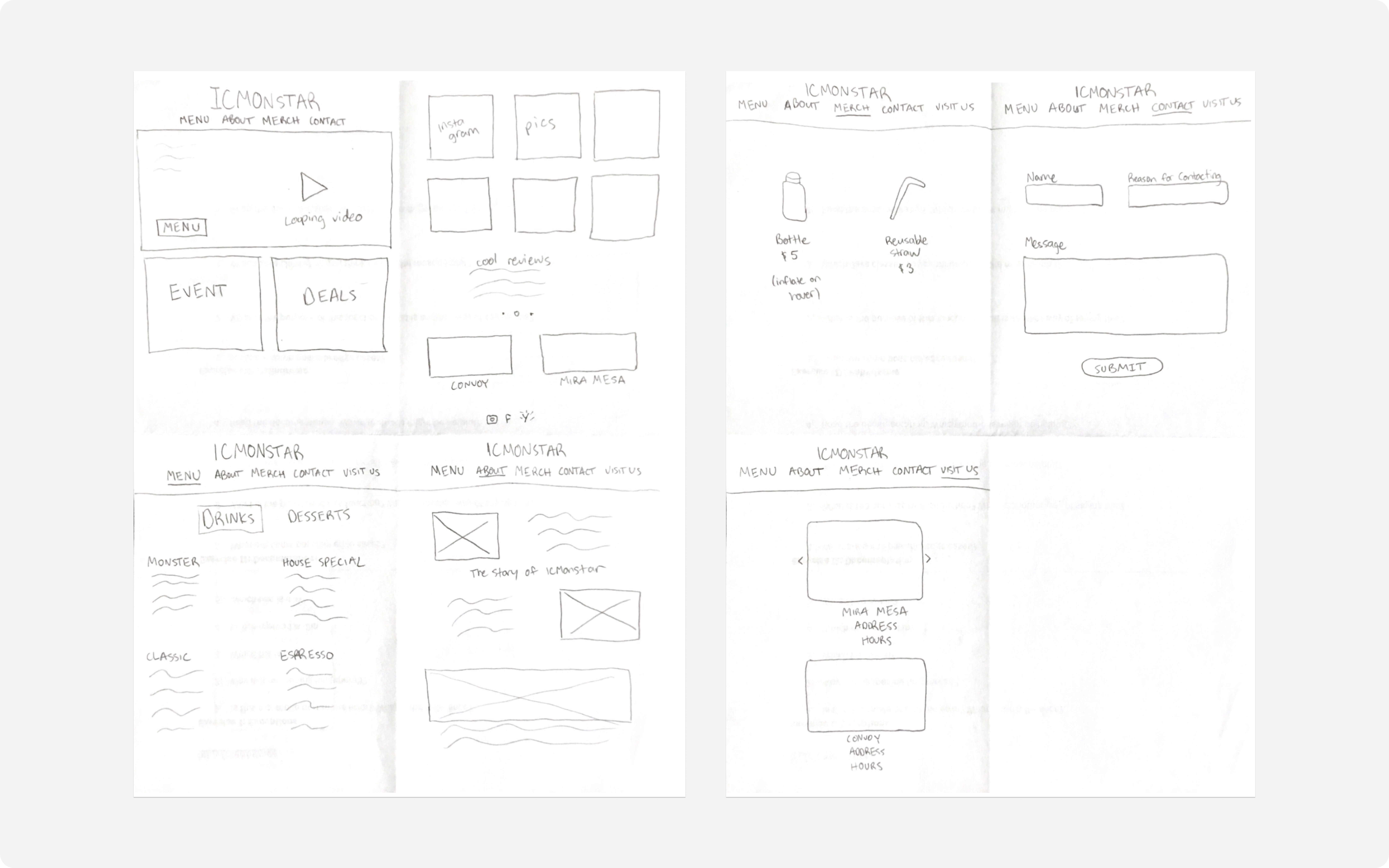
Sketches
We started with some initial sketches in order to quickly explore different layouts to iterate on before settling on one design. For these sketches, we focused on the following pages that were essential to the final website based on client needs and ICMonstar’s competitors:
DESIGN
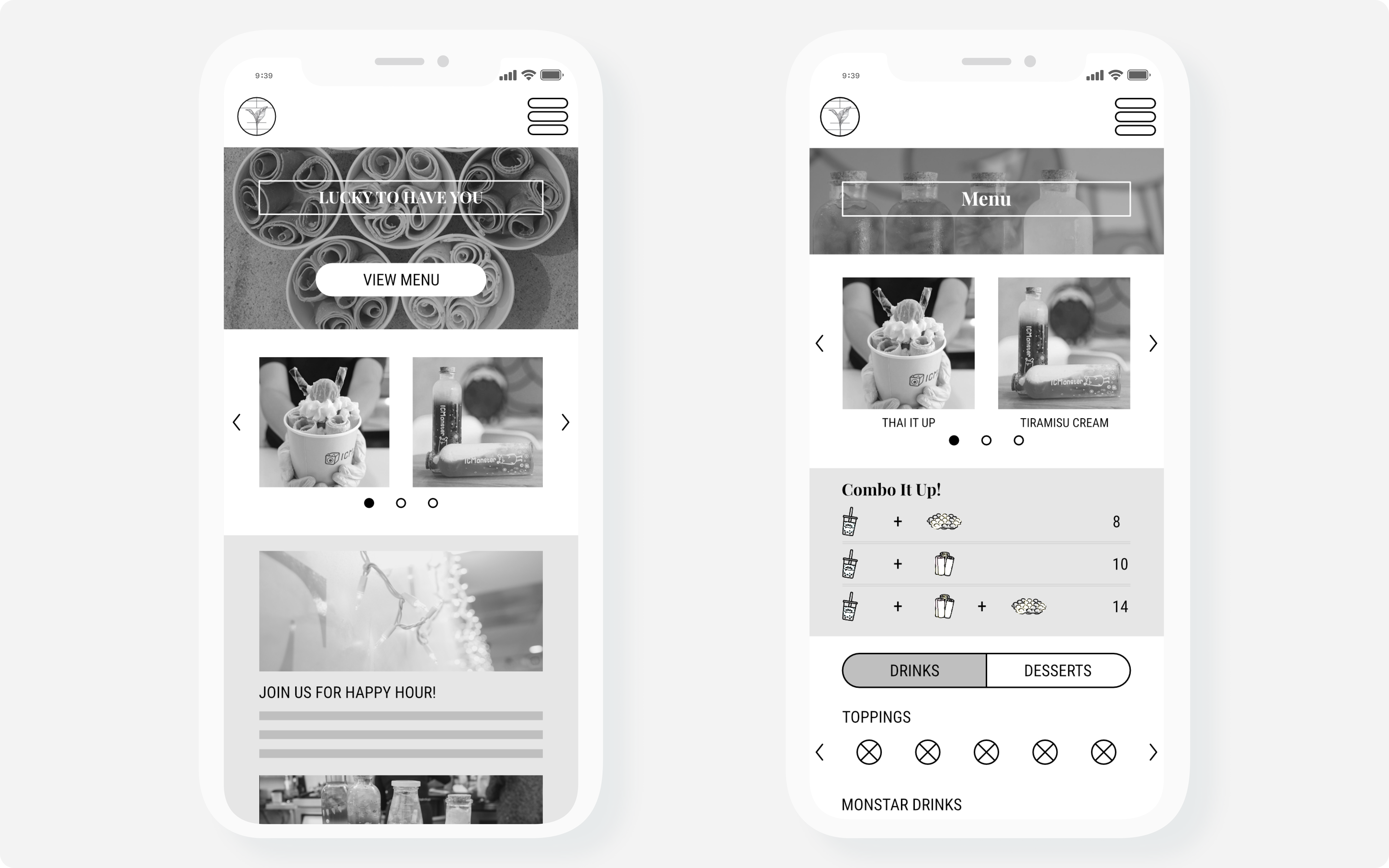
Wireframing
Once we were able to focus in on a basic website structure, we started wireframing more detailed mockups, making sure to add features requested by the client as well as making sure to emphasize the aesthetics, savings, and hospitality aspects of ICMonstar.
RESEARCH
Wireframe Usability Testing
From these wireframes, we began user testing to gain some early insights before proceeding with the prototype. We interviewed some ICMonstar customers and found that there were gaps between the user’s mental model and the conceptual model of our wireframe.
KEY INSIGHTS
- Scrolling on the menu page was not immediately obvious due to the prioritization of the image gallery and combos
- Menu toggle was obscured by the page fold
- “Image galleries are the first thing I would look at”
DESIGN
First Prototype
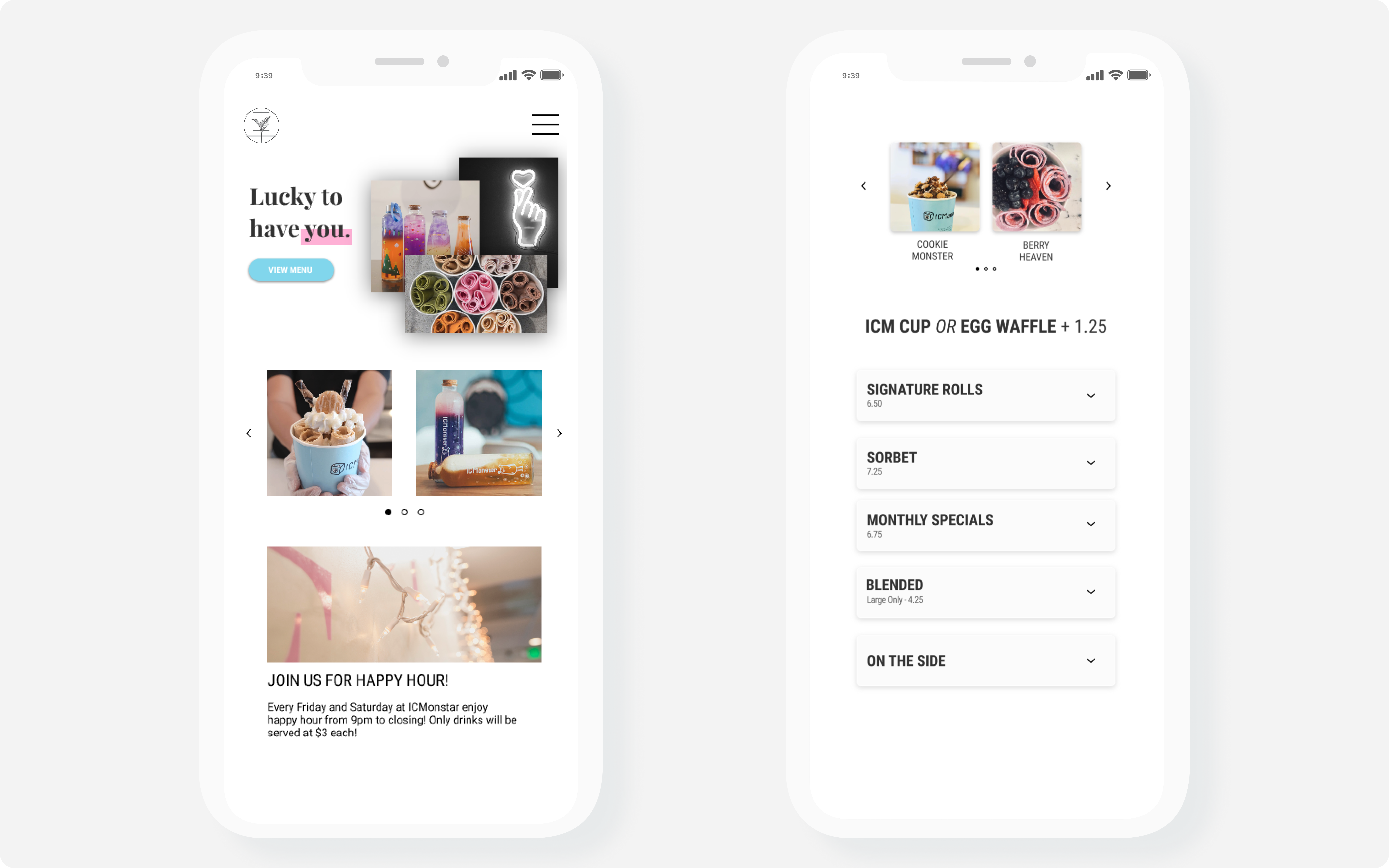
Due to a tight timeframe, we had to design without a concrete style guide. Despite this, we were able to quickly focus on function first and to decide on copy and form later. The greatest challenge for me was finding a way to present ICMonstar’s large menu without having the users scroll excessively. To solve this, I divided the menu in two with a toggle for Drinks and Rolled Ice Cream and further categorizing each drink type into an expandable menu.
RESEARCH
Prototype Usability Testing
After some additional user testing and feedback, we found that many users felt that the prototype came off as slightly uninviting and felt more like a startup’s website rather than one of an ice cream shop‘s. Other users commented on the vagueness of the “Lucky to have you” opening text, making it unclear as to what ICMonstar has to offer. However our expandable menu design was received warmly as users commended its organization and easy navigation, making it easy for them to view the offerings at a glance and expand if needed.
Final Design
Home Page
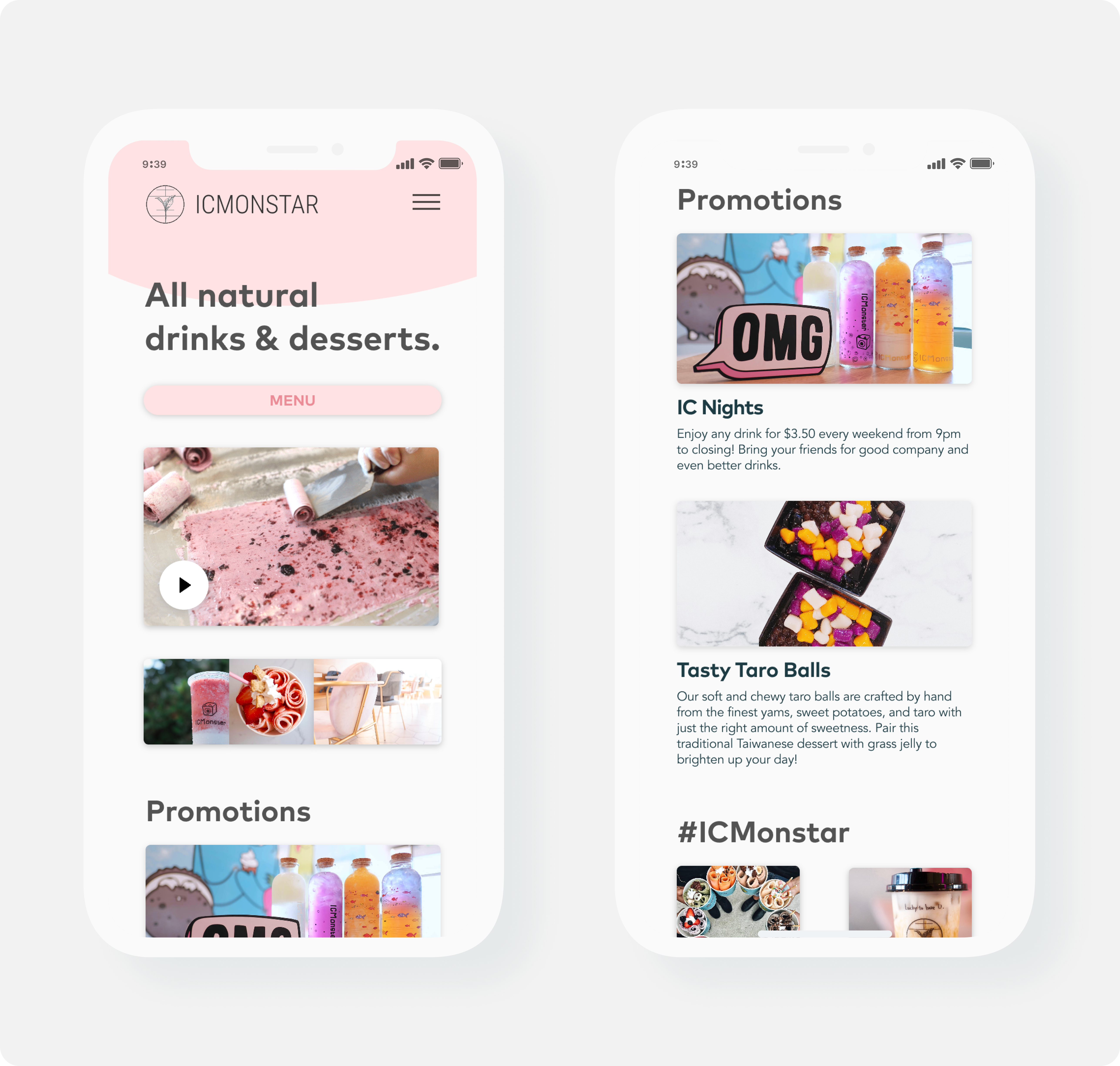
- Overhauled design to evoke the creamy colors of ice cream and milk tea, appealing to the aesthetics admirer
- Changed opening text to “All natural drinks and desserts” for a clearer intro to ICMonstar’s offerings
- Prominently displayed Promotions section to entice deal hunters and the college crowd
Menu
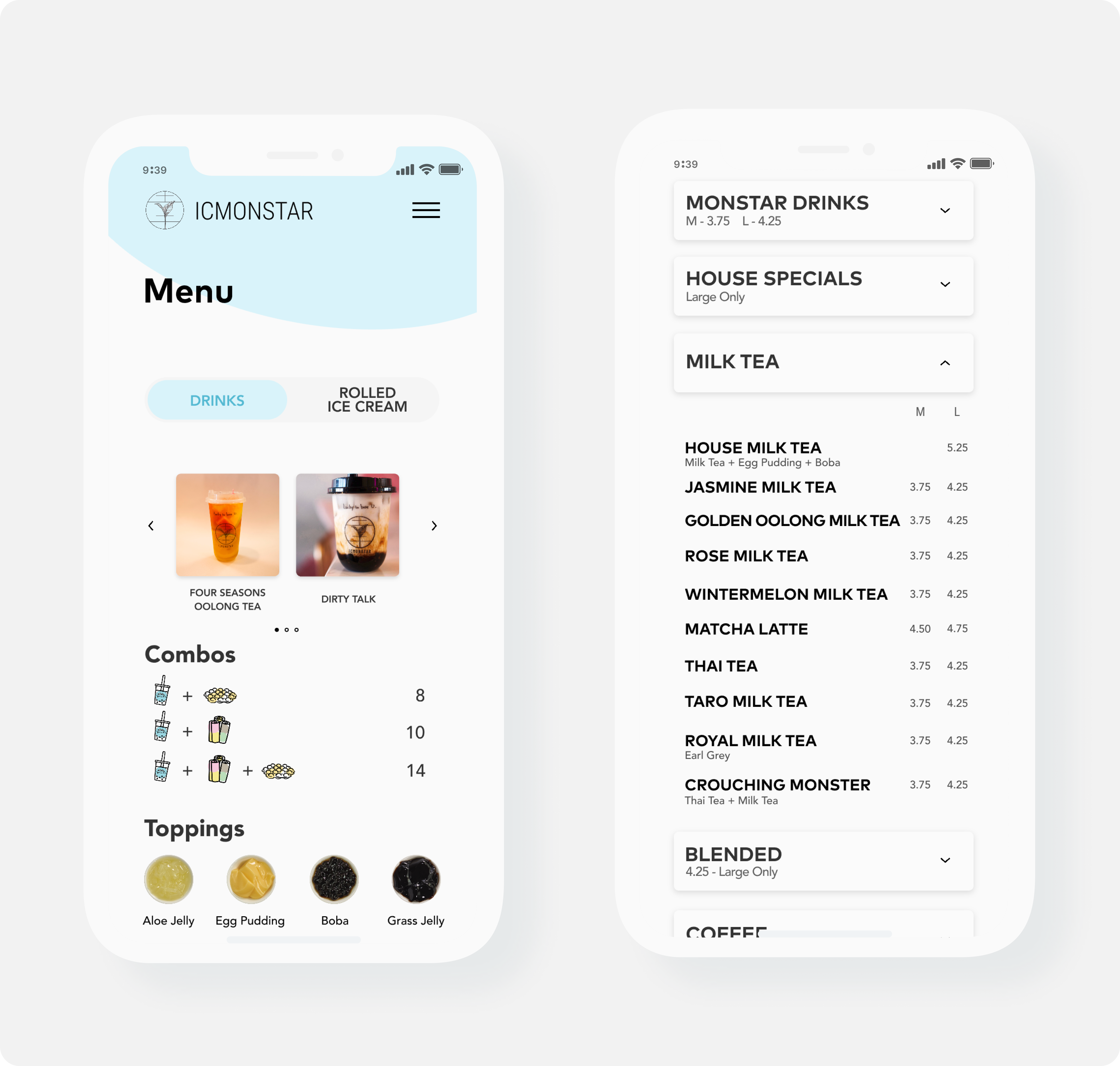
- Moved the Drinks/Rolled Ice Cream toggle to the top and made it more salient by increasing the size
- The image gallery was moved up as well based off user feedback
- Adjusted font of the expandable menus to make it easier to scan, helping out visitors like the hospitality hound
- Focused on showing and telling Jenna’s and ICMonstar’s story to get visitors of the page to become visitors of ICMonstar
- Emphasized ICMonstar’s unique offerings and press coverage to boost their reputation


Moving Forward
There are still a plethora of features I wrote down while working on the project that could be added in later iterations. A promotions section is one addition I feel could add user engagement and encourage visitors to take advantage of the current deals and promotions going on, increasing business to the shop.
As for the data on the impact of the new redesigned website, I’d like to monitor the engagement and time spent on certain pages, as well as the click rate of the map with directions to the shop. This should offer a strong lead on how many users have been convinced by the website enough to seek out directions to the shop.
Overall, I had an amazing time working on this project, creating and designing for small local businesses is an impact I wish to have on future ventures.
Thanks for making it to the end of this long read and feel free to contact me if you’d like to hear more or if you’d like to work with me!

