
Pharmate
Conceptualized and prototyped a self-service pharmacy kiosk to make the medicine pick up process more accessible and efficient
//CASE STUDY
//PRODUCT DESIGN
ROLE: UX/UI Designer, ,Product Designer, Researcher
TEAM: Lam Pham, Ryan Manalastas, Madeline Ng, Julie Fung, Allie Pai
TIMELINE: 3 months
Problem
Many pharmacies today deal with long wait times and unavailability during off hours making it a pain point for those with busy schedules. Additionally, older demographics are hesitant to visit pharmacies due to their language and cultural barriers, often having to recruit their loved ones to accompany them on pharmacy trips, a hassle for everyone involved.
RESEARCH
Digging into the problem
I first focused on researching existing pain points within the point-of-purchase aspects of the medical industry. After some diggine, I found several articles detailing the inefficiences of medical office phone and appointment systems, confirming that there are potential improvements to make within the pharmacy visit process. Despite this problem, we found very few examples of pharmacies attempting to address these issues. There are a few pharmacy delivery startups out there but none seem to address the in-store pickup process.
RESEARCH
User Interviews
We decided to conduct some initial user interviews to glean some insights into how the average person feels about their pharmacy visits and their experience with using kiosks. From these initial interviews, we found the following insights:
- 70% of interviewees felt that their pharmacy visits were either “too long” or “could be shorter”
- 60% of the interviewees have had experience using grocery store kiosks as well as the Amazon lockers
- Older demographics felt that the kiosks should be optional since they felt some hesitation relying on technology to manage their prescriptions
RESEARCH
Storyboarding user journeys
With the data gathered, the team created storyboards to visualize a variety of different user flows and what the desired user experience would entail. Storyboarding was very useful in engaging all members of the team to string together our personas and create a seamless kiosk experience that integrates into users’ lives.

DESIGN
Prototyping
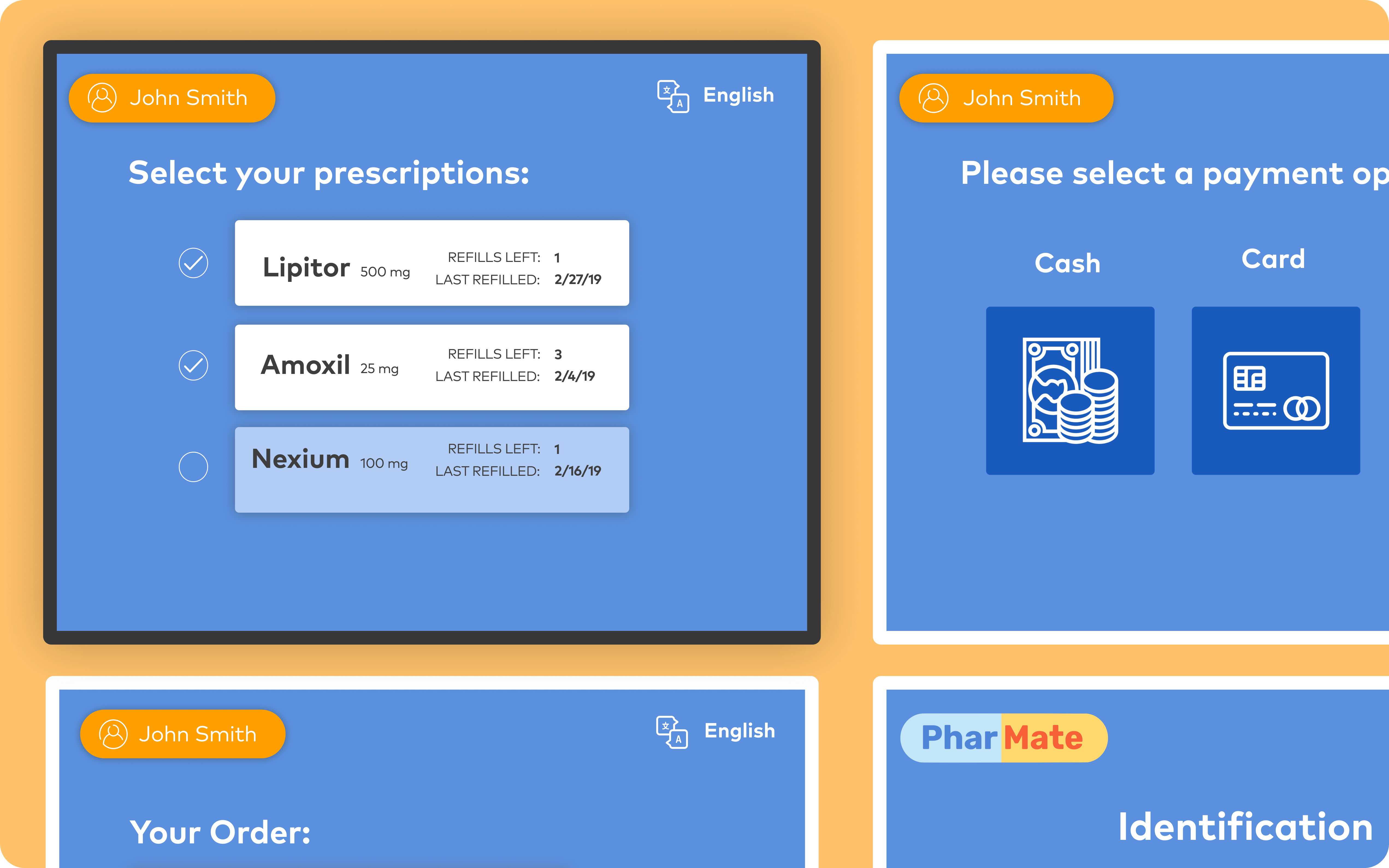
From the initial user research and storyboarding we set out to create some low fidelity prototypes which would allow for rapid iteration and testing. I decided to go with a simple page by page process which would essentially hold the user’s hand throughout the entire kiosk experience.


Paper protoype

Kiosk mockup
RESEARCH
Paper prototype testing
I then had three users test out the paper prototypes, allowing me to identify if there were any areas of improvement to be made in the next iterations. From these initial tests there were moments in which the user felt confused and didn’t know what the next step was, making it clear that visual feedback is essential to bridging the user’s gulf of execution and evaluation.
KEY INSIGHTS
- Due to a lack of clear signifiers, one user swiped their card on the screen instead of the card reader below
- It was unclear for some on where to pick up the medicine after payment
- The fake price was set to $0 which confused another user, stressing the importance of using real prices to make the testing scenario as real as possible
DESIGN
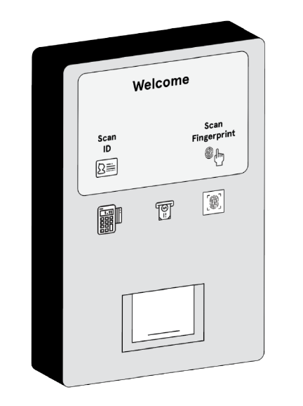
Mid Fidelity Prototype

Initial wireframes
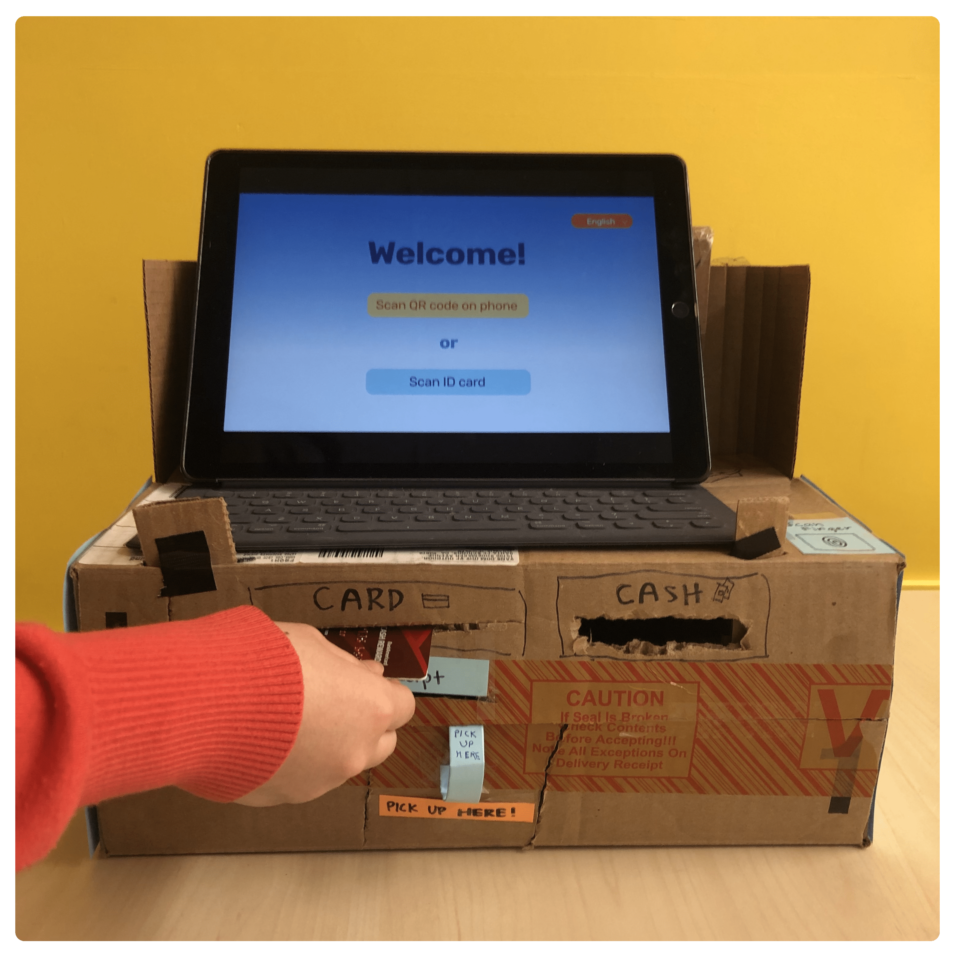
The first cardboard prototype
Prototype testing
In order to test the physical cardboard kiosk prototype, I observed and interviewed three students who had some experience using kiosks at other stores.
KEY INSIGHTS
- Users got confused with the different physical kiosk interactions due to a lack of visual feedback
- One user incorrectly used the universal card reader and left his ID inside until he reached the payment stage
- The minimalistic approach led some users to request more information regarding the medication
Final Design
By testing the clickable prototype we were able to gain actual insight on how user-friendly our process was. Although the users made it through our tasks with little to no hiccups and had positive views on the overall process, we still gained valuable insights which led us to focus on two main areas for the high fidelity iteration:
Identification Process
- Increased visual feedback by including lights on the physical kiosk once an identification process was chosen

Checkout Process
- Added relevant information regarding medication uses and availibility

 The final cardboard kiosk
Moving forward
Since our kiosk is an optional service for pharmacy visitors, some future steps would be to figure out how to encourage visitors to opt for the kiosk method. Onboarding more users would alleviate wait times and allow pharmacists to focus on their work. 2020 update: with the current pandemic and social distancing, tools such as this kiosk would alleviate contact with others. By placing this kiosk outside and allowing wireless pay and pickup, many visitors would feel much safer when ordering and retrieving their medicine.