
Policy Admin System
I designed a policy management platform to enable customer advocates to service customers more efficiently
ROLE: UX/UI Designer, Researcher
TEAM: Sam Oloyede(Product Manager), Trish Jimenez(Project Manager), Jo Ann Dillion(Engineer)
TIMELINE: 6 months, November 2021 - May 2022
Problem
As a rapidly growing insurtech startup, Coterie Insurance was beginning to struggle with the growing amount of customer requests coming in each day. Our customer advocate team had to manage these requests by using a suite of different products making their job extremely inefficient. As such a need was born to create a system that would handle all aspects of policy management, enabling our customer advocates to service customers more efficiently.
RESEARCH
Getting to know the users
I led a series of UX interviews with various members of the underwriting and customer advocacy team in order to gain a sense of a typical day in the life and learn what pain points they had in their workflow.
KEY INSIGHTS
- The software they use is outdated and unintuitive, causing them to create workarounds to make their job more efficient.
- Updating customer billing information was by far their most common request.
- Note taking is their most valued step of their daily workflow.
RESEARCH
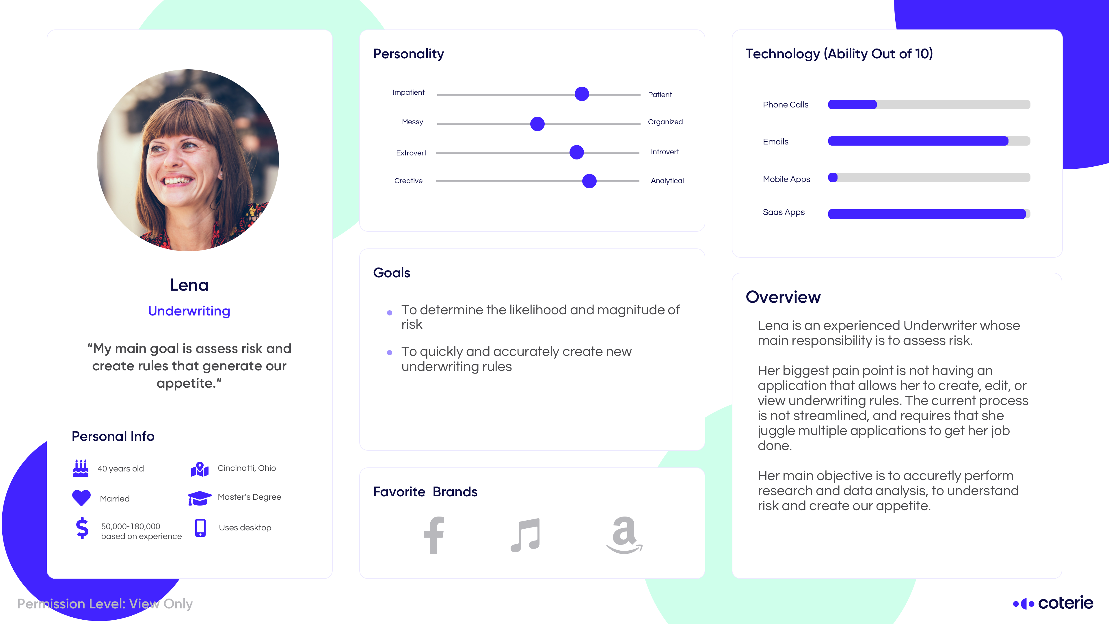
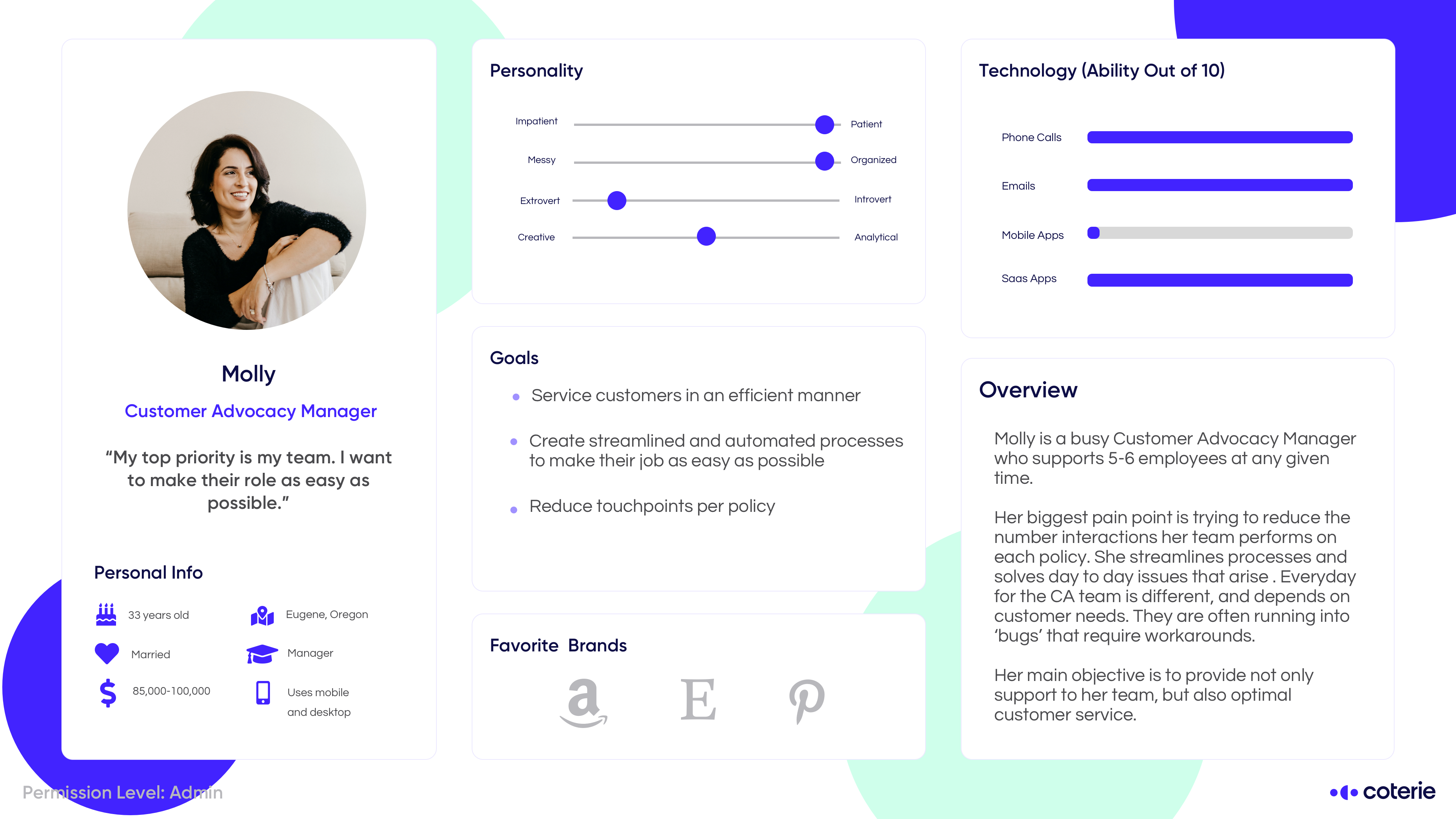
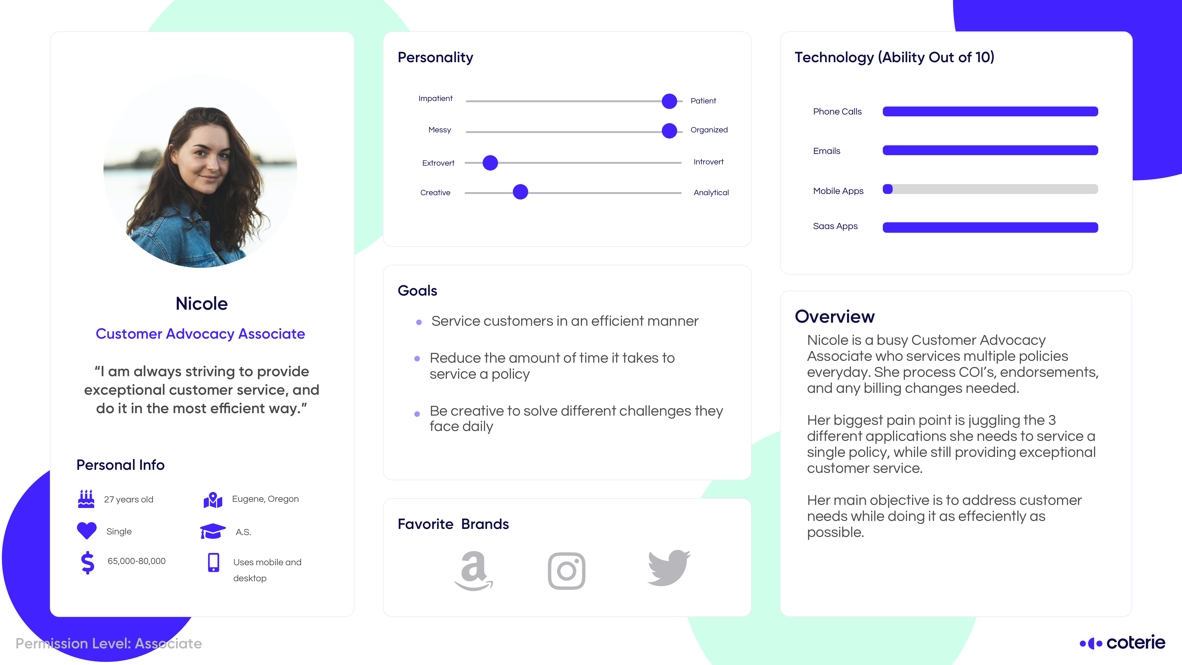
Personas
Although this Policy Admin System is a highly specialized product centered around our customer advocates, through the user research performed earlier I identified varying groups that all used the same software differently. Working together with design and product, we shared our findings and compiled them into a few personas.
RESEARCH
Competitive Analysis
Luckily many of our customer advocates had prior experience using different versions of policy management systems at their previous roles. This enabled me to gather their thoughts and do my own research on these products. From my research done in the previous phase, two products stood out from the answers, Applied Epic and Attune Insurance. Unfortunately most of the software in the insurance world is highly specialized and not designed with the user in mind. Applied Epic and Attune were the two that took different approaches to similar problems and so I wanted to dig into them further.
Applied Epic
- Robust program meant for the advanced user
- High learning curve and set up time
Attune Insurance
- Much more intuitive and minimal user interface
- Less features and customizability for the advanced user
DESIGN
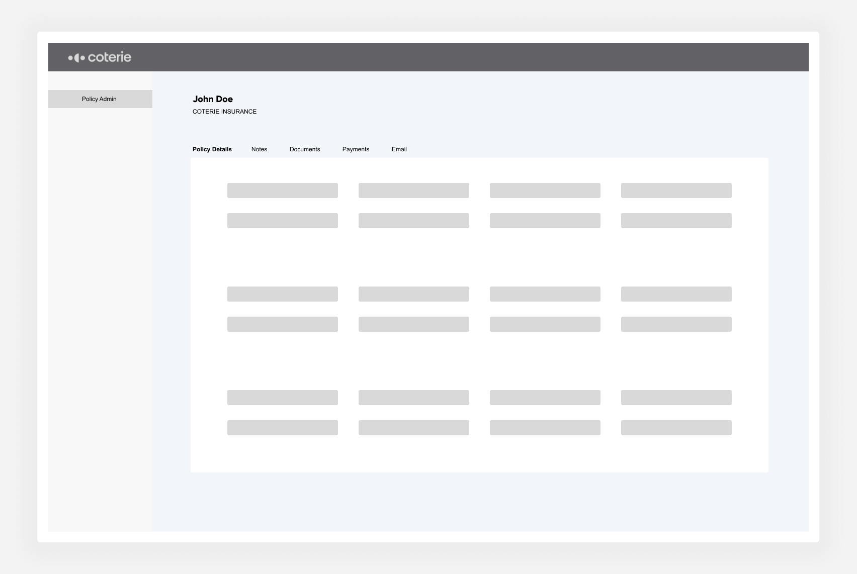
Wireframing
Based off the user research and competitive analysis, I wanted to combine the technical functionality that Applied Epic offers with the user-friendliness of Attune Insurance. I identified the main tasks that our customer advocated performed and put them into tabs, a layout that was familiar to their mental model of a policy admin system.
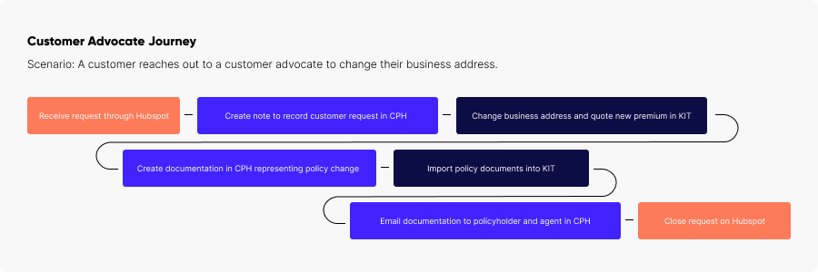
RESEARCH
Low-Fi Usability Testing
After receiving postive feedback from stakeholders and product I further fleshed out the wireframes to create a low fidelity clickable prototype that I could test on the users. I wanted to improve on their existing note-taking process with this prototype and so I decided to make a sticky notes component on the page that would always allow them to view and edit notes wherever they were. The goal of this testing round was to gauge how the users felt about the overall layout of the product and the note-taking feature.


KEY INSIGHTS
- 40% of the testers were confused when asked to add a note due to either their previous workflow or confusion about the combined Notes/Tasks component.
- The majority of testers were pleased with the Policy Details page, only nitpicking on the placement/addition of certain fields.
- “I liked that it combined the feel of KIT and CPH to create a new document. That way we will not have to "re-learn" how to complete these tasks.”
DESIGN
Hi Fidelity Prototype
Thankfully at Coterie we had a great design system in progress that allowed me to easily translate the low fidelity designs into a high fidelity version. After further sharing the low-fi designs with stakeholders, I received new requirements to add onto the designs in order to fully support Coterie’s upcoming Worker’s Compensation policies. In this iteration of the prototype I also added a quick actions bar at the top as a way to allow customer advocates to easily perform their most common tasks.
RESEARCH
Hi Fidelity Testing
With so many changes to the information architecture and workflow, it was important for me to further test with the customer advocates. I wanted to see how they felt about the quick actions component and if this proposed design would fit seamlessly into their current workflow and not become another source of friction. Again, I used Maze to get quick and accessible feedback but this time I gave the testers more complicated tasks in order to give them the full experience of using the tool.

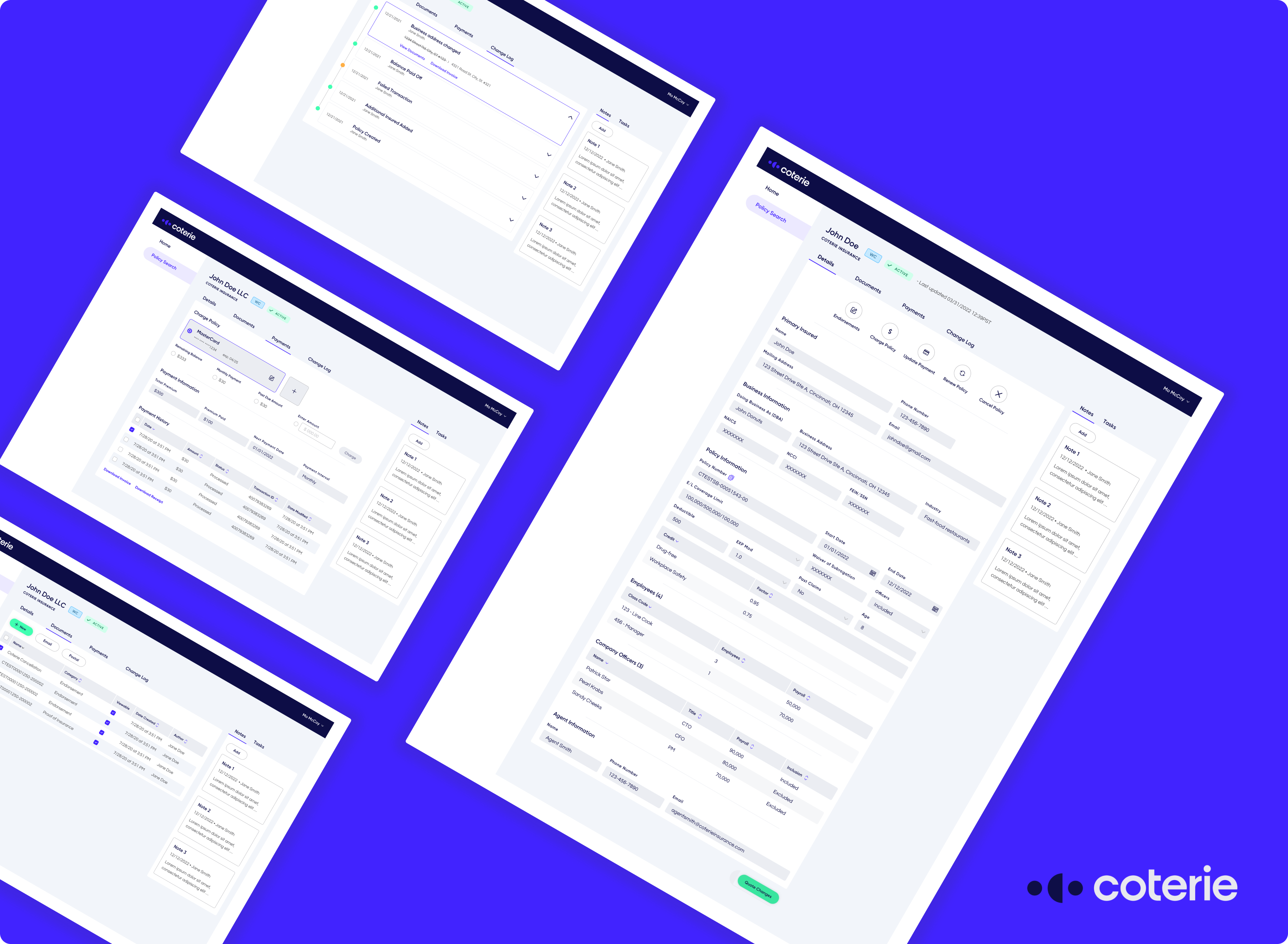
Final Design
Policy Search
- Created a nested search interaction to support multi-policy holders.
- Utilized colored policy and status chips to increase scannability.

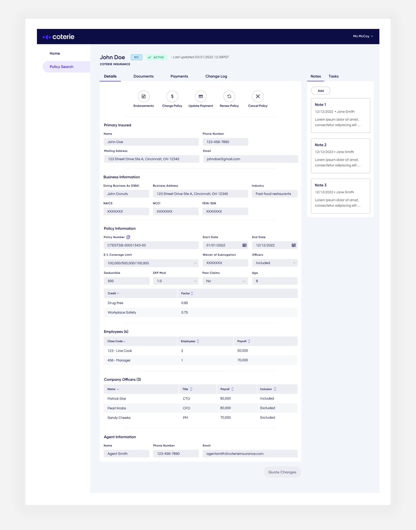
Policy Details
- Organized the most pertinent policy categories from top to bottom.
- All endorsements are done in this one screen to prevent jarring screen changes.
Payments
- Enabled users to quickly edit billing information and charge policies based on preset amounts.

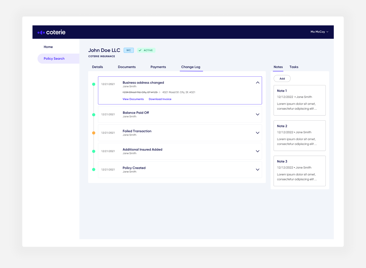
Change Log
- The change log allows users to view the full lifecycle of a policy and all endorsements and payments made to it.
Results
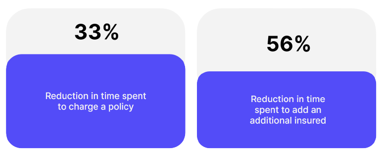
In the end, this MVP certainly met the goals set in the beginning, I was able to condense all policy info on one screen and enable CAs to fully service our policies, saving them time in the process. I was able to significantly reduce the steps involved in core workflows such as charging a policy or adding an additional insured.